

One list for every journey
Properties now have a dedicated Funnels page, right next to Reports, Anomalies, and Events in the property navigation. It lists every funnel you have defined, each with its conversions and conversion rate for the selected period, plus two bar charts that show how both numbers moved day by day.
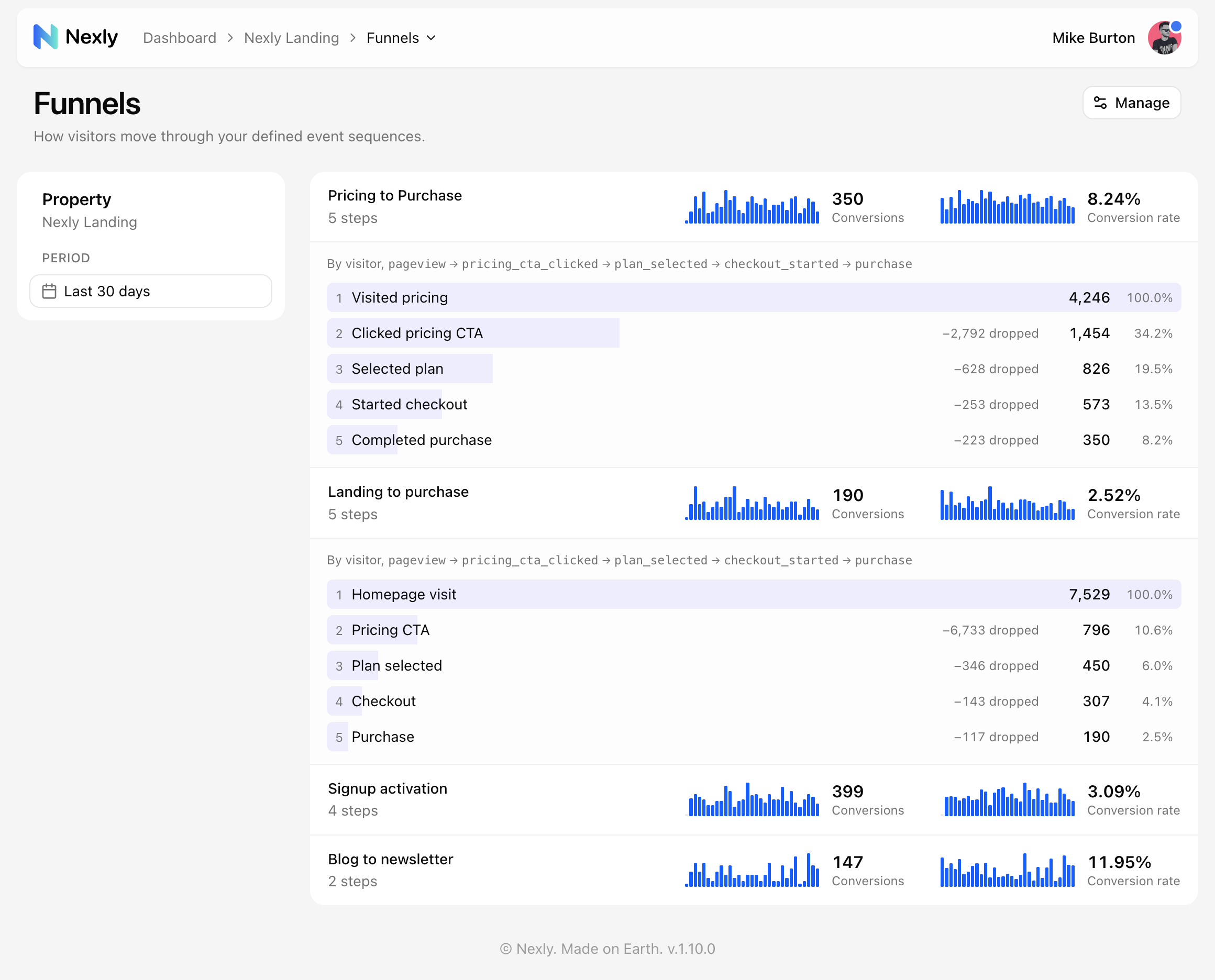 Each row carries the period totals and daily trends; clicking a row reveals the step-by-step breakdown.
Until now, checking on funnels meant opening the dashboard widget and switching between them one at a time. The new page answers the recurring question in a single glance: which journeys are converting, which one is slipping, and whether a dip is a trend or a one-day blip.
From the headline number to the exact step
Click any funnel to expand it in place. The breakdown shows every step with its count, the share of everyone who entered the funnel, and how many people dropped between steps, so you can go from "conversion is down" to "we lose most people between plan selection and checkout" without leaving the list.
The period switches between the last 7, 30, and 90 days, and the sparklines follow along. Editors can jump to funnel management from the Manage button in the header; creating and refining funnels works the same way as before, described in the funnels guide.
Part of a bigger release
The Funnels page ships with Nexly 1.10, the first release out of beta. If you are new to funnels, See where every funnel loses momentum explains how steps, counting identities, and data filters work, and Insights can still suggest funnels worth tracking if you would rather not start from scratch.