Dashboard tour
The property dashboard is the main place to understand traffic, behavior, acquisition, technology, geography, custom analytics, and bot activity. Open it after you create your first property and verify the first event.
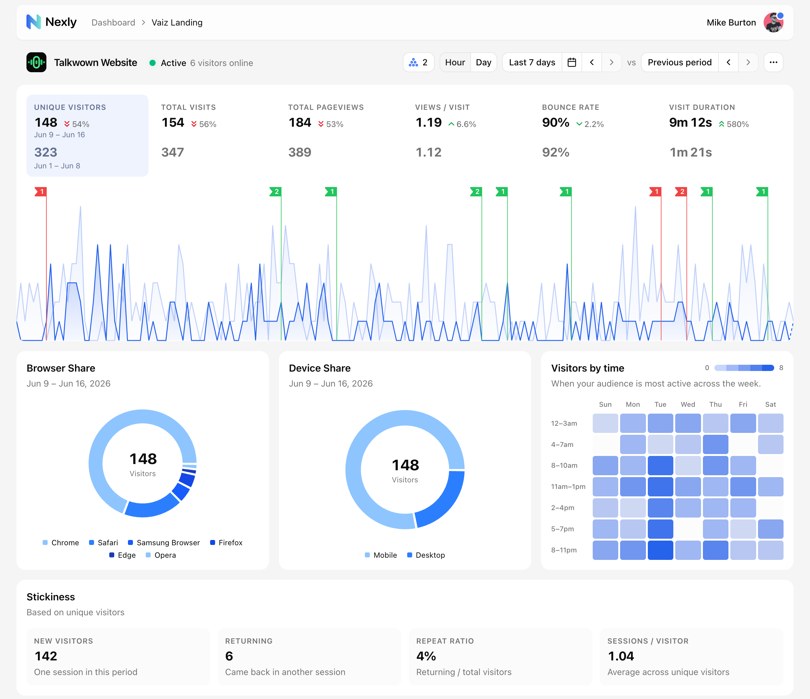
Header and live state
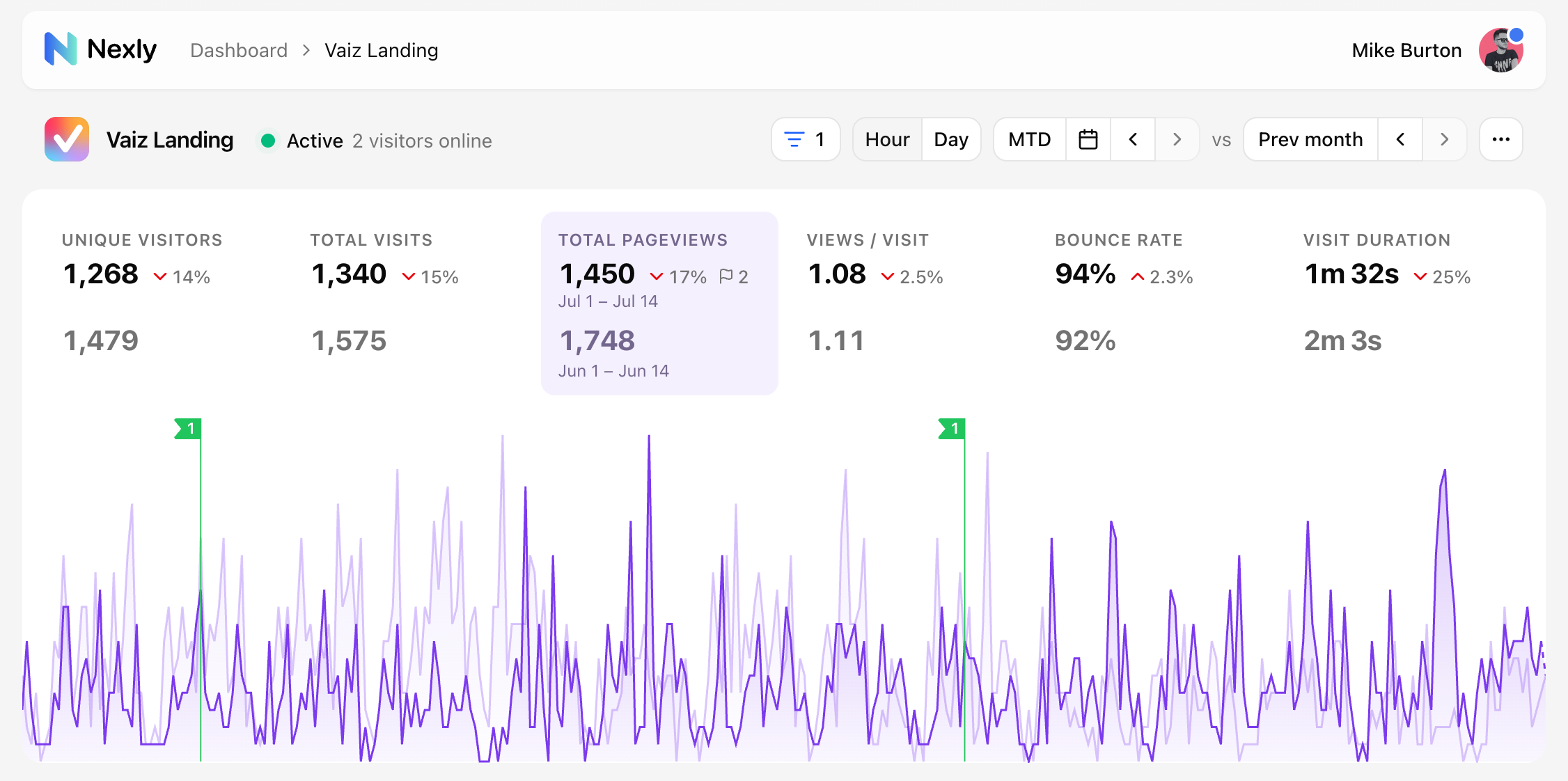
The property header shows the current property, breadcrumbs, quick navigation, and a live indicator.
The live indicator helps you understand recent activity:
- Active means Nexly has seen recent visitors.
- Quiet means the property is connected but has no recent traffic.
- Paused means ingestion is intentionally stopped in settings.
Date range and comparison
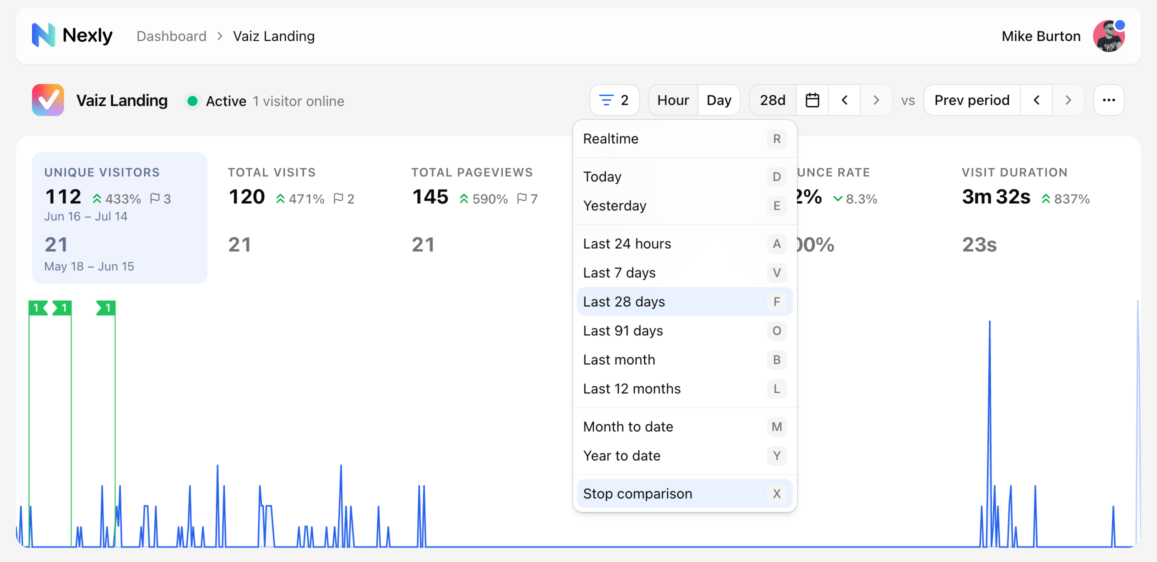
Use the date range picker to select presets such as today, yesterday, the last 7 days, month to date, year to date, or a custom range. Each preset has a keyboard shortcut shown next to it.
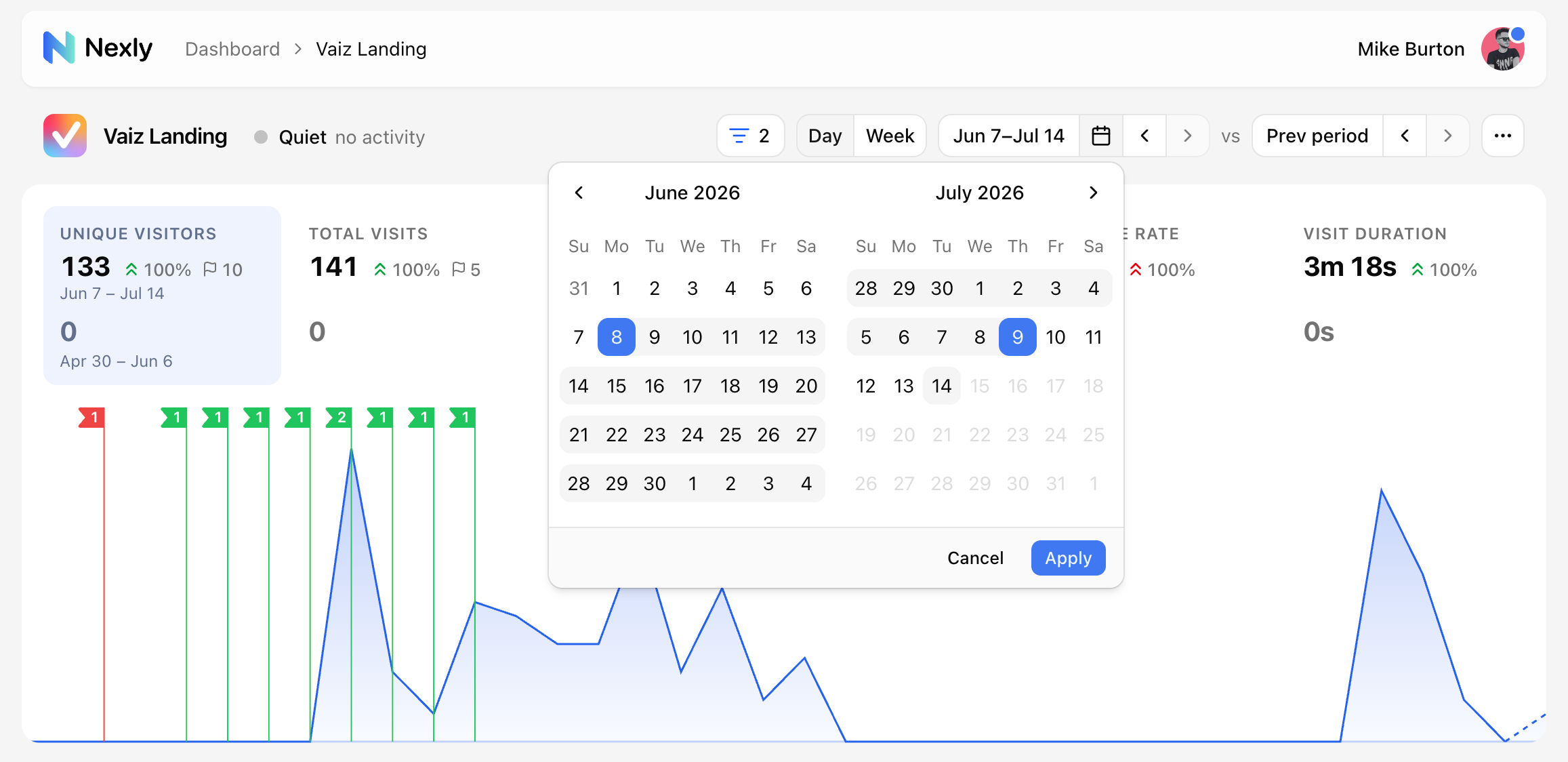
For a custom range, pick the start and end dates in the calendar.
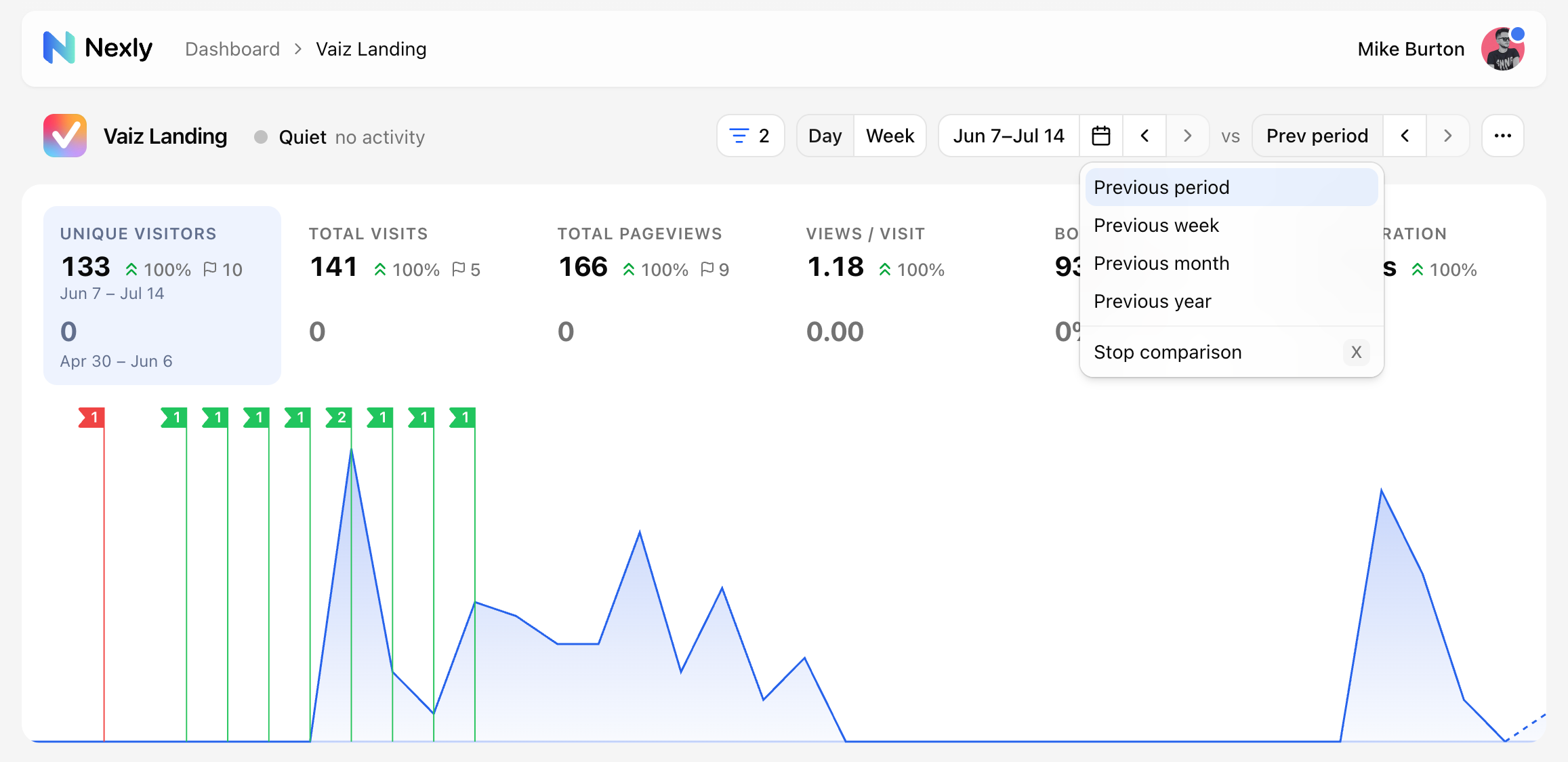
Compare mode overlays a previous period, previous week, previous month, or previous year. This affects the visitors chart and metric cards so you can see how the current period changed.
Headline metrics
The top metric cards summarize the selected range:
- Unique visitors.
- Total visits.
- Total pageviews.
- Views / visit.
- Bounce rate.
- Visit duration.
Each card can show a comparison value when compare mode is enabled.
Visitors chart
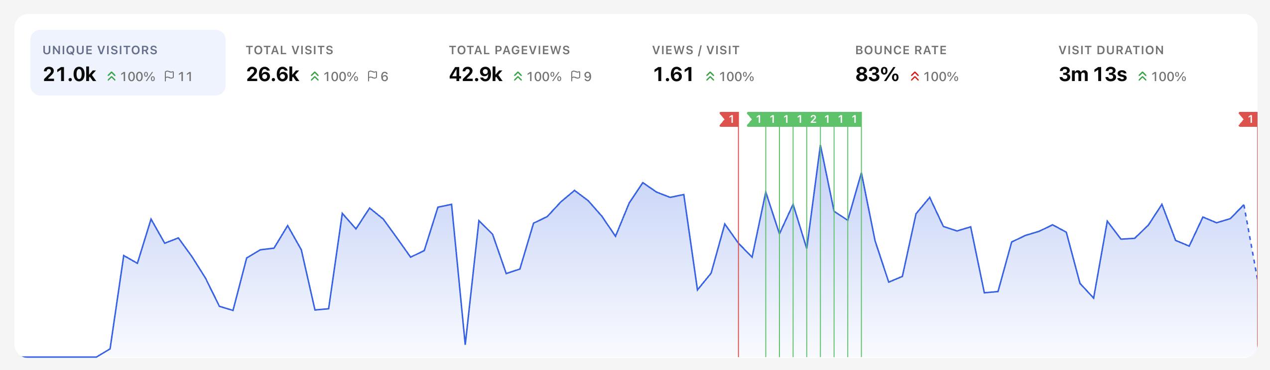
The visitors chart shows one selected metric over time. Use it to spot growth, drops, spikes, and recurring patterns.
When a time bucket is still in progress, Nexly renders it as an incomplete tail so you do not mistake partial data for a finished period.
When Nexly detects an incident for the selected metric, the chart can show a flag at the incident time. Metric tabs above the chart can also show an incident marker, but only on the metric where the unusual spike or drop was detected.
Zoom into a time window
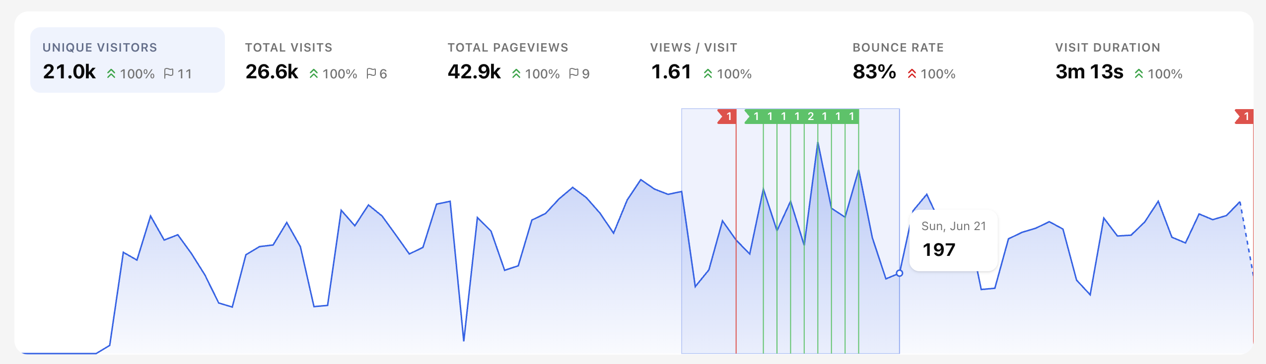
To look closer at a part of the chart — a spike, a dip, or a cluster of incident flags — select it directly on the chart instead of building a custom range in the calendar.
Click and drag horizontally across the area you want to inspect. The selected window is highlighted while you drag.
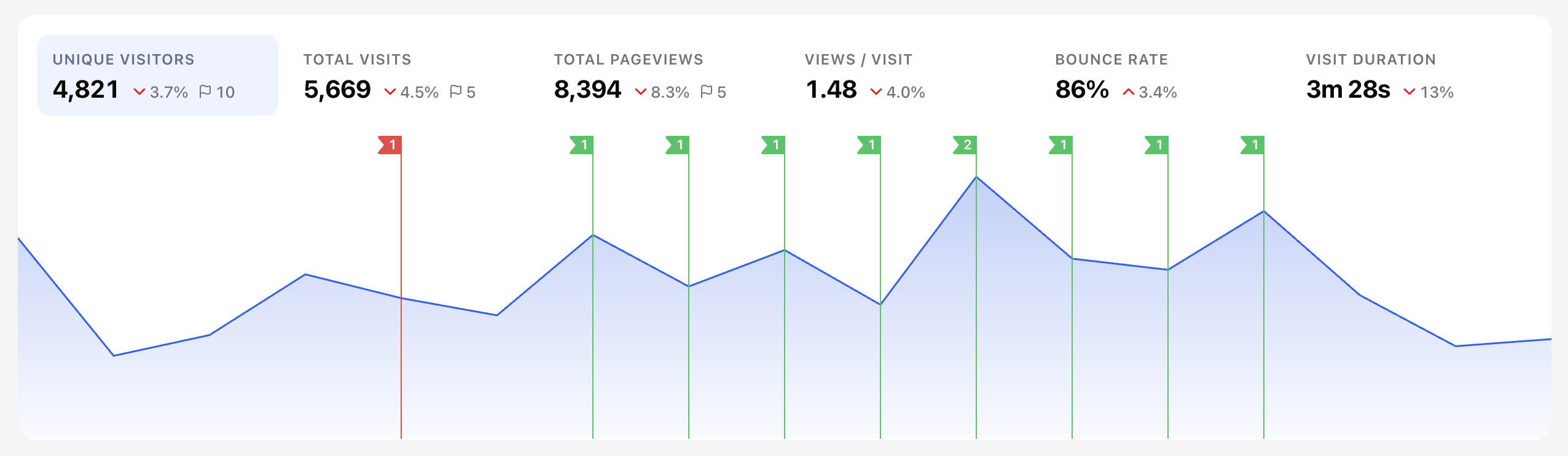
Release the mouse to zoom in. The selection becomes the active date range, so the chart, metric cards, and all widgets update to that window. You can keep dragging to zoom in further, or use the date range picker to return to a preset.
Widgets
Dashboard widgets break the same traffic down by useful dimensions:
- Top, entry, and exit pages.
- Countries, regions, and cities.
- Browsers, operating systems, devices, and SDK clients.
- Acquisition channels, sources, campaigns, and UTM values.
- Time heatmap by weekday and hour.
- Custom events and custom properties.
- Bot, crawler, and AI referral activity.
Many widget rows are clickable. Clicking a value adds a dashboard filter.
Saved views
Saved views preserve the current dashboard state, including filters, date range, comparison settings, tabs, and sorting. Use personal views for your own workflow and team views when everyone should share the same perspective.