Dashboard widgets
Dashboard widgets break your traffic into dimensions that explain who visited, how they arrived, what they used, and what they did.
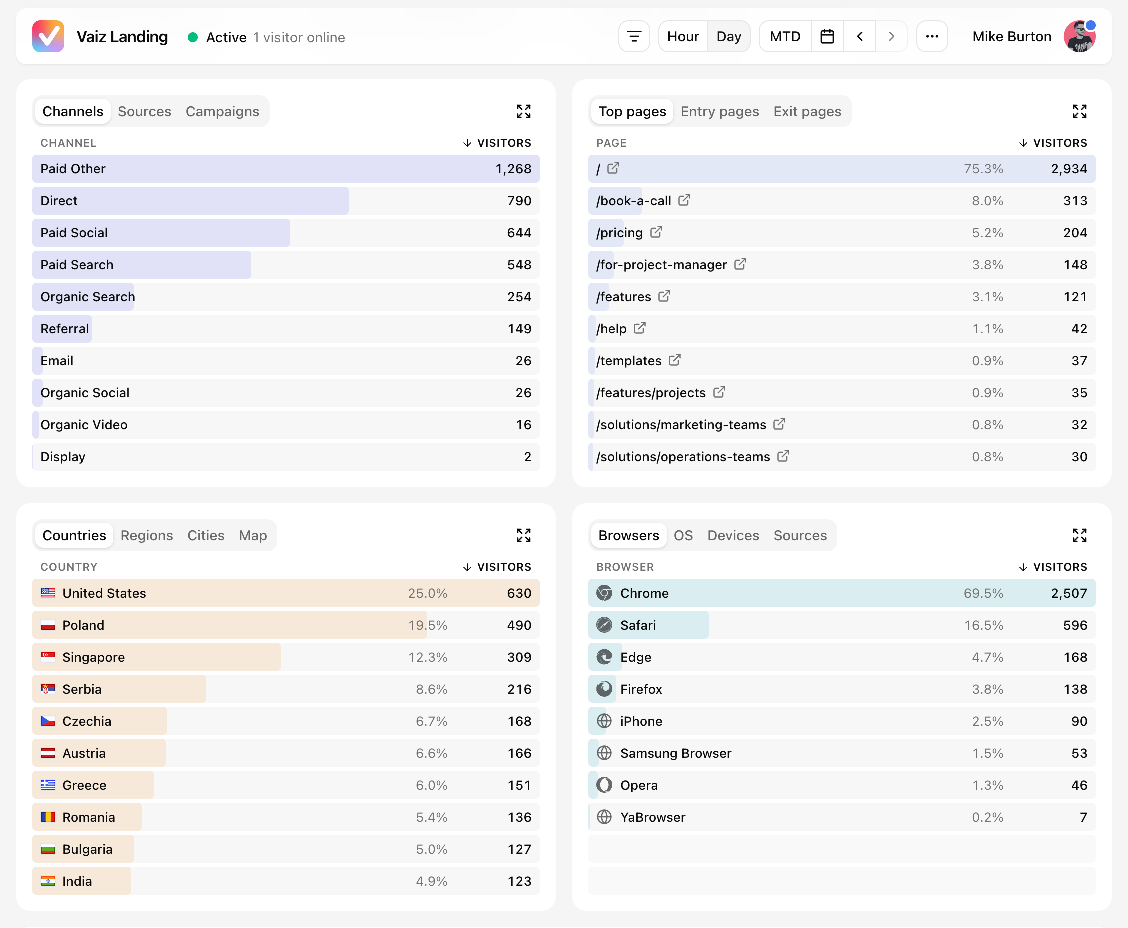
Top pages
The pages widget shows which content attracts visits and where visits begin or end.
Top pages ranks pages by the number of visitors who viewed them. Use it to find your most popular content and compare each page's share of traffic.
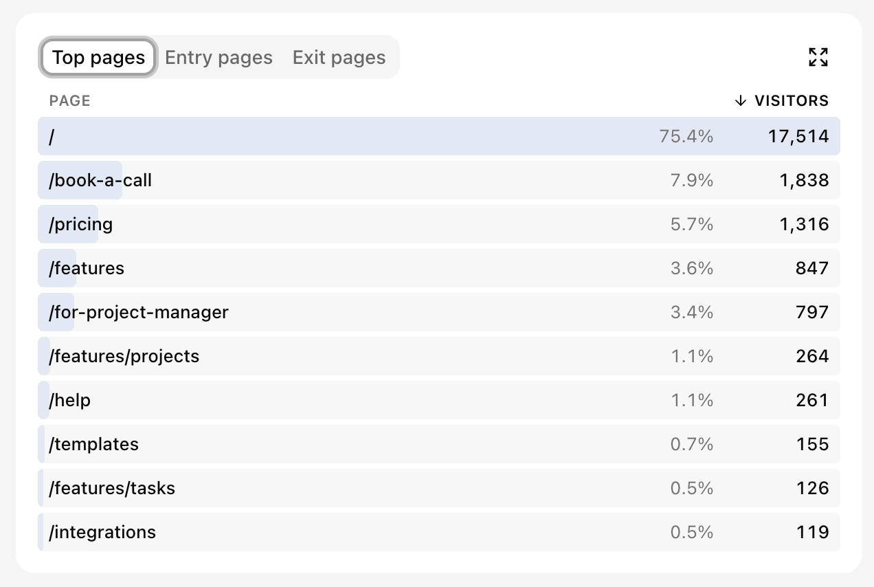
Entry pages ranks the first page opened in each visit. It helps identify the landing pages that bring people into your property.
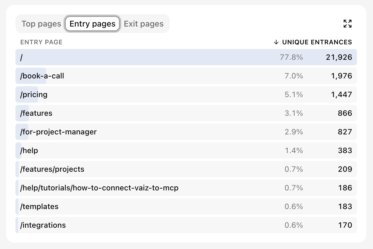
Exit pages ranks the last page viewed before a visit ended. A high exit count can be expected on completion pages, but may reveal friction elsewhere.
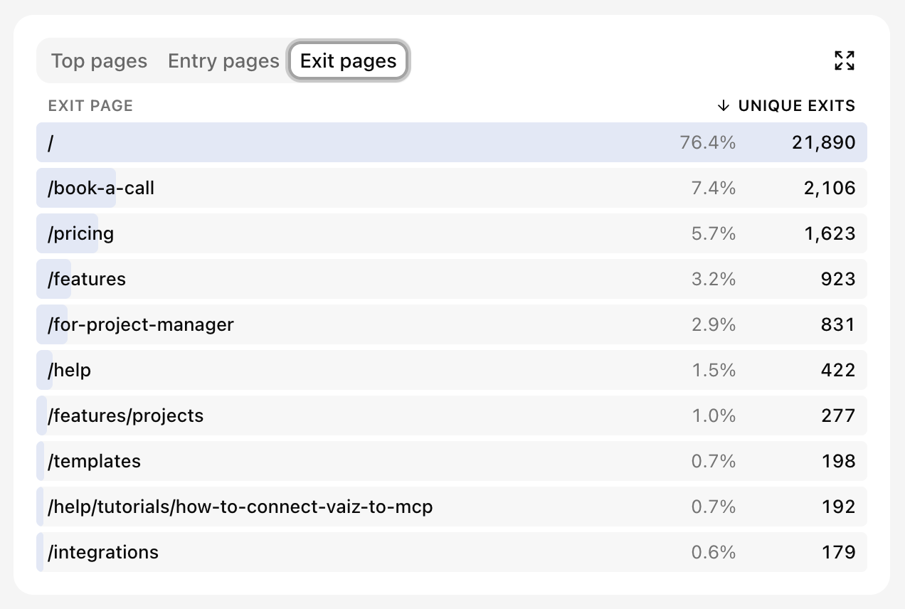
Locations
The locations widget shows where visitors are located when geographic data is available.
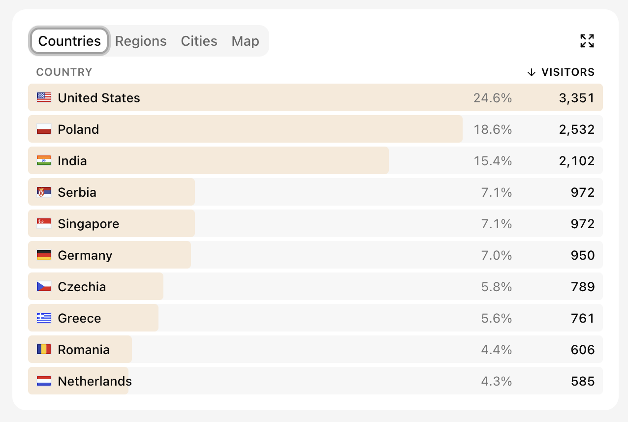
Countries gives the broadest breakdown and shows each country's share of visitors.
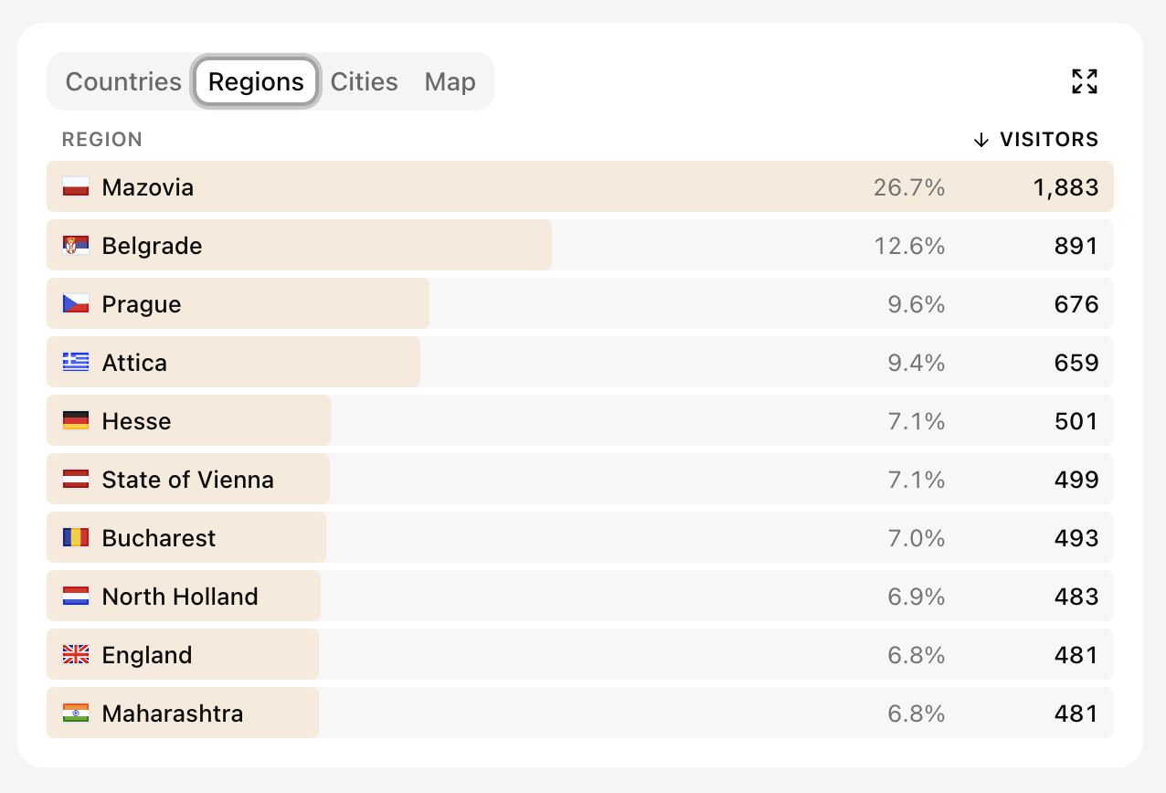
Regions provides a closer view inside countries, which is useful for comparing states, provinces, or other first-level areas.
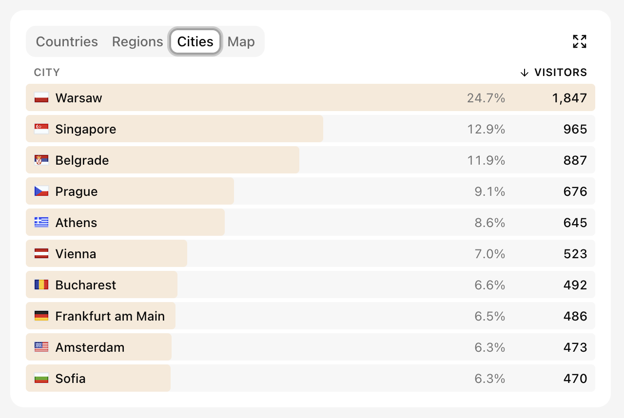
Cities shows the most active local areas. Use it to check city-level campaigns or concentrations of customers.
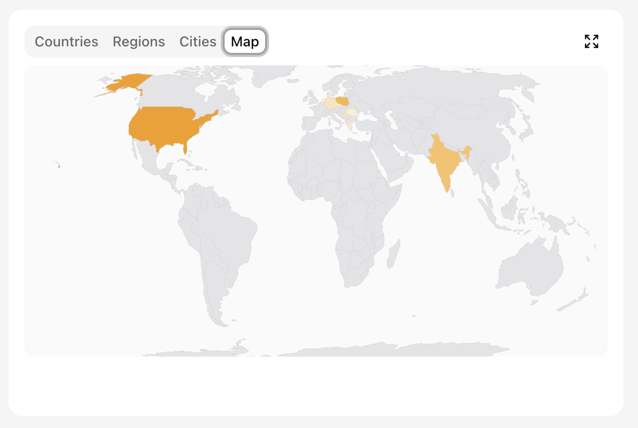
Map provides a visual overview of the same country-level distribution.
Technology
Technology tabs explain how visitors access your property.
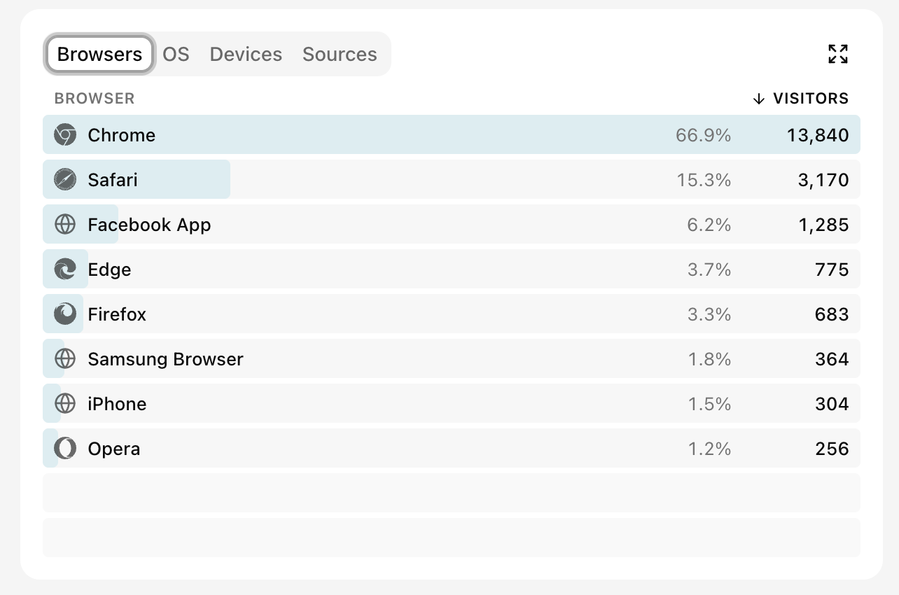
Browsers shows which browsers your audience uses. This can help prioritize compatibility checks.
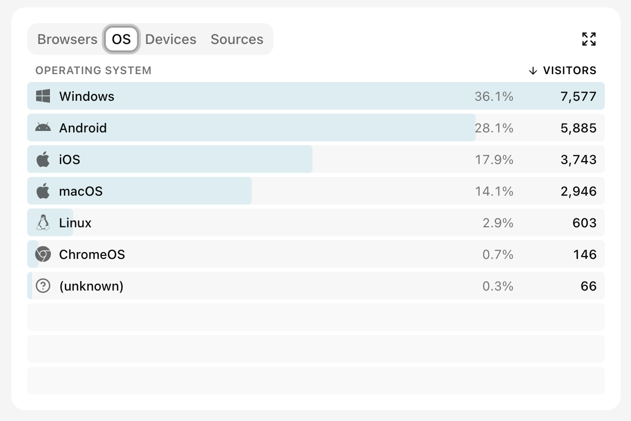
OS groups visitors by operating system.
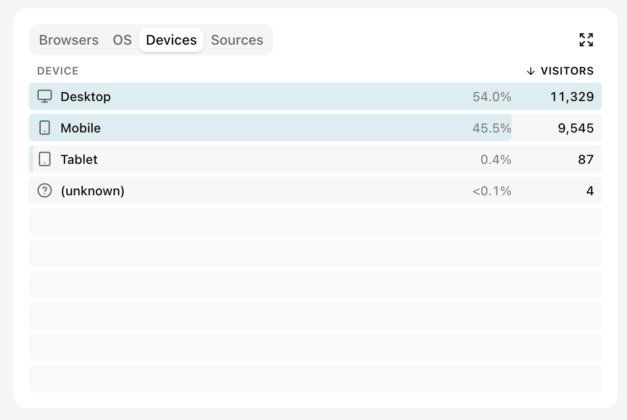
Devices separates desktop, mobile, and tablet. Events without device information — for example, server-side events — fall into an unknown bucket. Use it to understand which screen classes matter most to your audience.
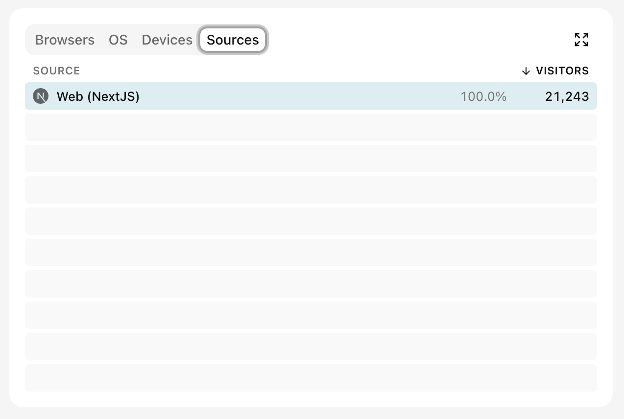
Sources identifies the Nexly client that recorded the visit. Web sources include the hosted script, vanilla JavaScript, React, Next.js, and React Native (Web) for React Native apps running in the browser. Mobile sources include React Native, Flutter for iOS or Android, Swift for iOS, and Kotlin for Android. Backend events sent with the Node.js SDK appear separately. This is useful when one property receives events from several applications — see One property or several? for how to decide between that setup and separate properties per platform.
Acquisition
Acquisition explains how visitors arrived and how campaign attribution is grouped.
Channels combines traffic into categories such as paid search, organic search, referral, organic and paid social, organic video, direct, email, and AI Search. Start here for a high-level comparison. Hover a channel to see exactly what lands in it.
AI Search is the one worth spelling out: it counts people who clicked a link to your site out of an AI assistant — ChatGPT, Gemini, Claude, Perplexity, Microsoft Copilot, Le Chat, Meta AI and similar chat surfaces. They are ordinary human visits, attributed by the assistant's referrer, and they appear in Sources under the assistant they came from. AI crawlers such as GPTBot or PerplexityBot are a different thing entirely: they never run the tracking script, so they are counted in the AI & crawler activity section instead, from server-side bot detection. A vendor's marketing or docs domain (mistral.ai, openai.com) is not a chat surface and stays an ordinary referral.
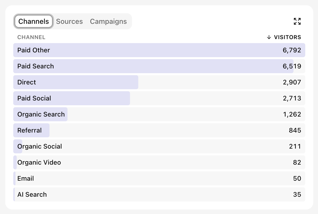
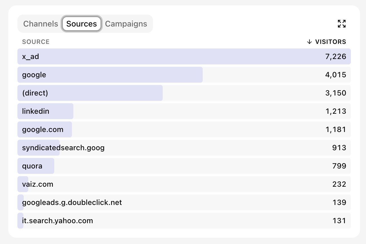
Sources lists the individual referrers behind those channels, such as a search engine, referring domain, campaign source, or direct traffic. Each row carries the site's logo — a bundled brand mark for well-known sources and assistants, otherwise the site's own favicon, fetched and cached by Nexly rather than by your browser, so no third-party icon service learns which sites your dashboard lists. Known brands are also shown under their own name ("ChatGPT" rather than "chatgpt.com"); filtering still uses the recorded value.
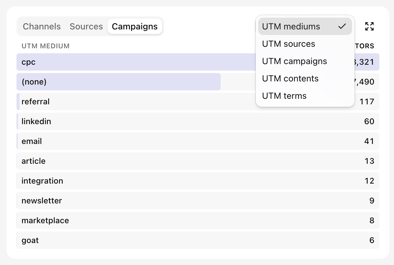
Campaigns groups attributed traffic by UTM medium, source, campaign, content, or term. Use the dimension menu to switch between them without changing the dashboard date range or filters.
Expanded views
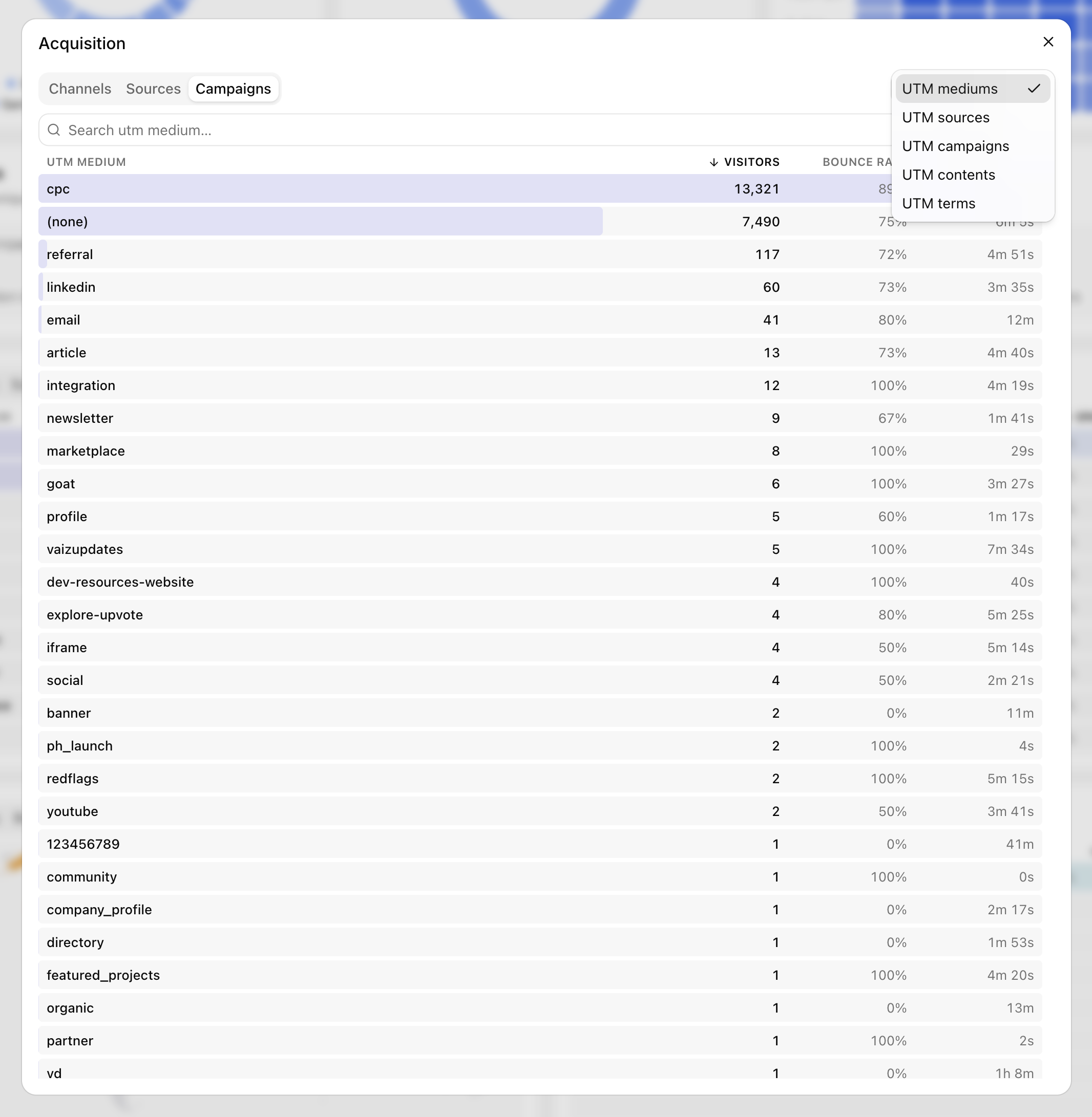
Select the expand button on a list widget to open a larger, searchable table. Expanded tables show more rows and additional metrics such as bounce rate and visit duration. Tabs, sorting, and dimension selectors remain available.
Audience patterns
The audience section combines four quick views:
- Browser share and Device share summarize how visitors access the property.
- Visitors by time highlights the weekdays and hours when the audience is most active.
- Stickiness separates new and returning visitors, shows the repeat ratio, and summarizes sessions per visitor.
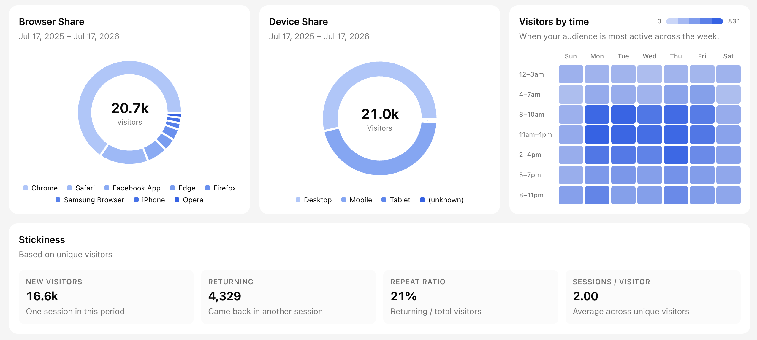
Set your timezone in Account settings → Preferences when you need the heatmap to align with a specific market. The timezone is a personal preference — each team member can pick their own without affecting others.
Custom analytics
The custom analytics widget turns the actions and properties you defined into dashboard breakdowns.
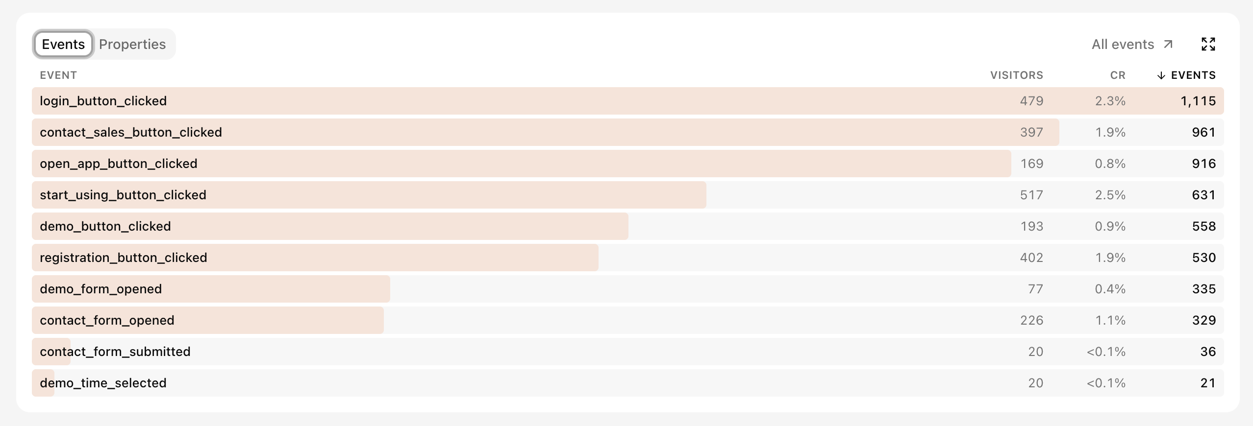
Events ranks approved custom events and shows unique visitors, conversion rate, and total occurrences. Click the image to learn how to register and approve event names.
Properties breaks down the values of an approved custom property using the same visitor, conversion, and event metrics. Click the image to learn how to approve property keys under Custom data.
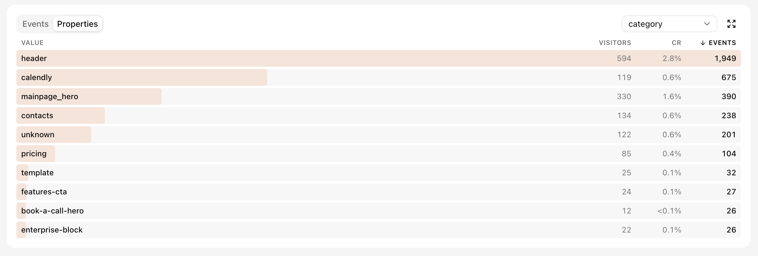
Use it for product actions such as signups, purchases, trial starts, onboarding steps, feature usage, or any event that matters beyond pageviews. See Custom events and properties to send events and approve event names and property keys in settings.
Funnel
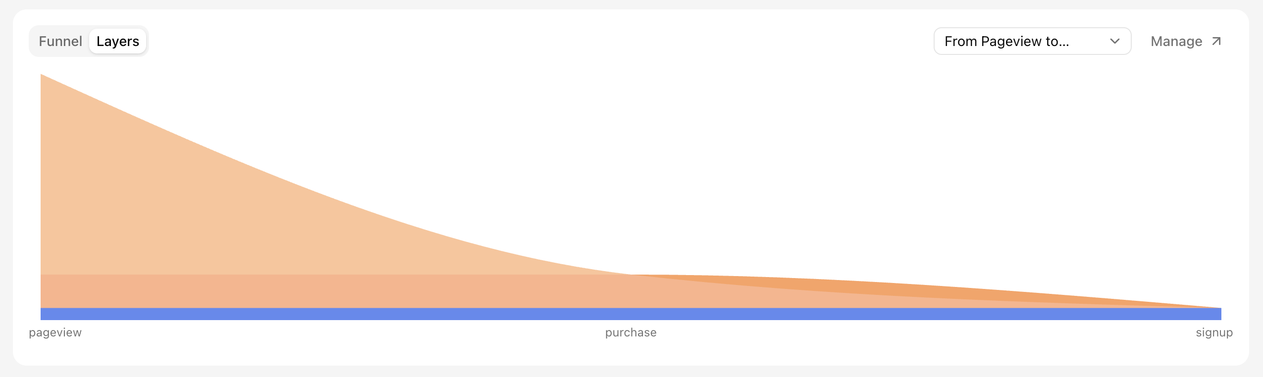
The funnel widget shows how many visitors or sessions completed each step of a funnel you defined in property settings. Use the selector to switch between funnels and Manage to edit them.
Funnel shows the count at each step and makes drop-off visible. Hover a segment to see conversion from the first step and the number that dropped at that step. Click the image to open the setup guide.
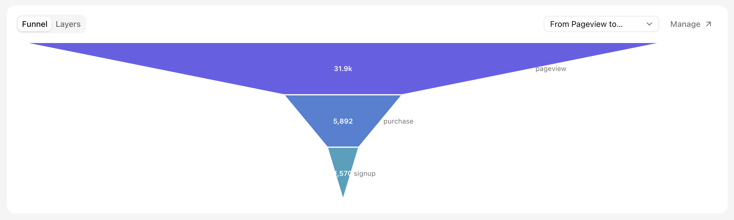
Layers shows the same result as stacked cohorts across the steps. Each layer represents the group that stopped at a step; the bottom layer represents everyone who completed the funnel.
The Funnels guide also explains counting modes and step data filters.
Bot and crawler activity
The bot and crawler section separates human activity from automated traffic and answers three different questions:
- AI referrals shows visitors arriving from AI assistants over time, split by source.
- Bots vs humans compares classified bot traffic with human traffic.
- Search vs other crawlers separates search-engine crawlers from other automated visitors.
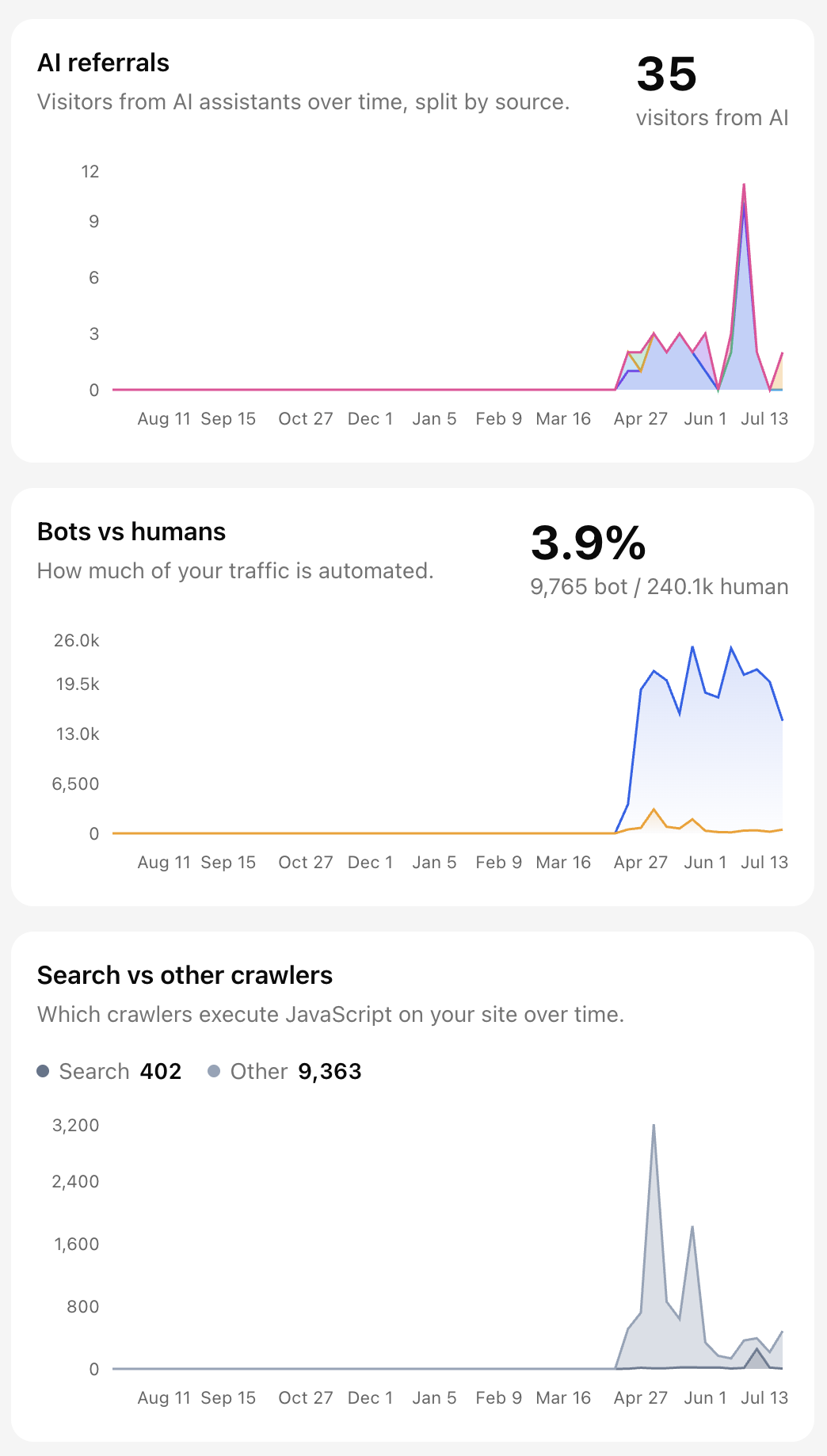
Use these charts to understand traffic quality and changes in automated activity. Treat AI referrals as a lower-bound signal because some referrers may be stripped by browsers or apps.
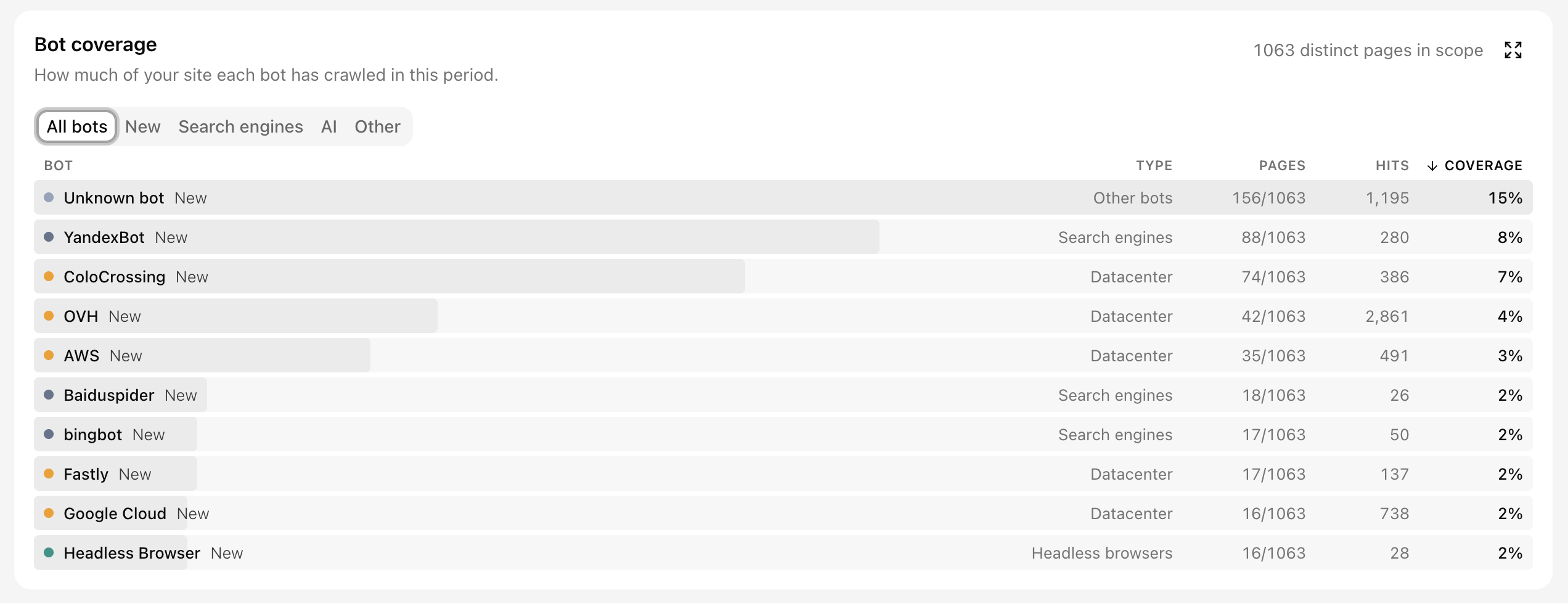
Bot coverage shows how much of your property each bot reached during the selected period. Pages counts distinct pages reached, Hits counts requests, and Coverage compares pages reached with the total number of pages in scope. Use the category tabs to focus on new bots, search engines, AI bots, or other automated traffic.
Clickable rows
Many widget rows can be clicked to filter the dashboard. This makes widgets both a summary and a navigation tool for deeper exploration.